Portfolio
Cato VPN
Creating an ultra minimalist VPN experience for the
iOS and MacOs platforms.
Creating an ultra minimalistVPN Experience
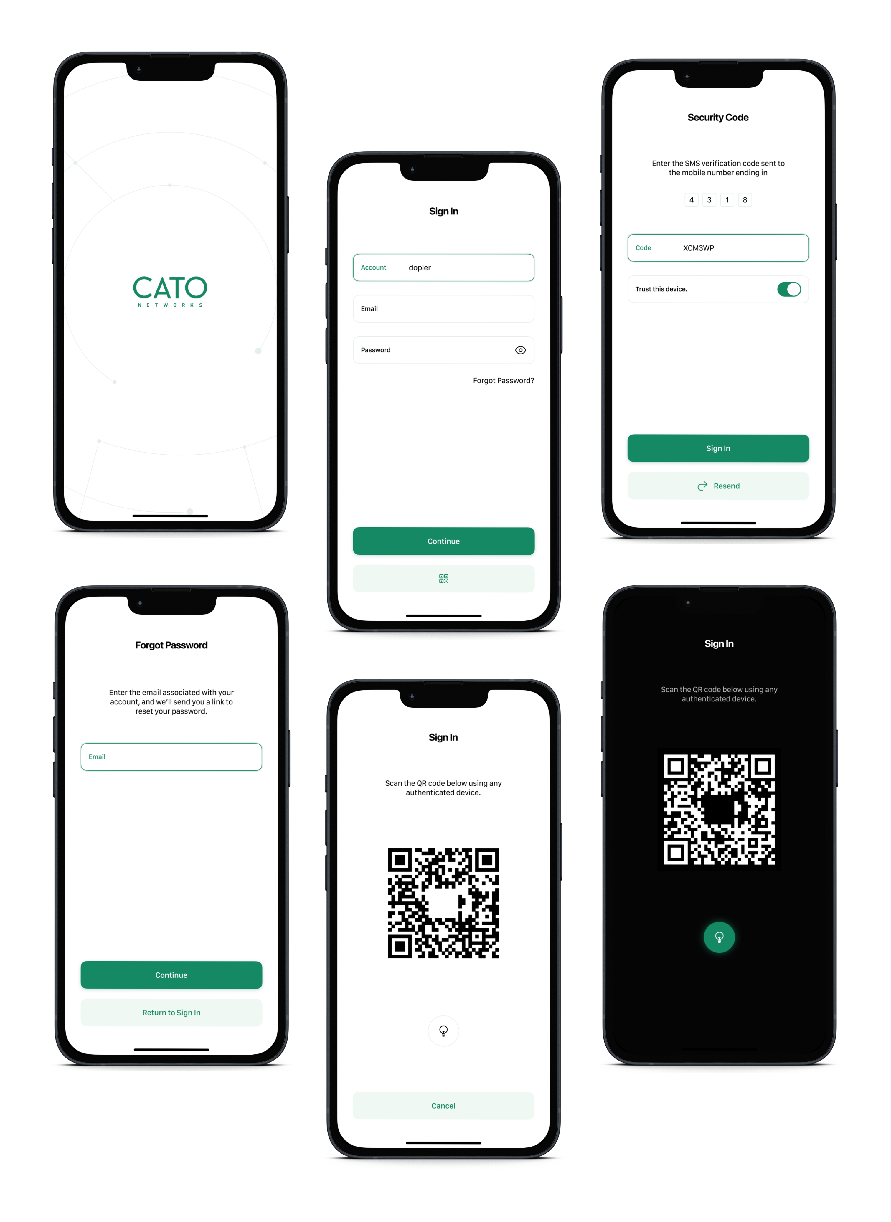
Cato Networks is the leading provider of Secure Access Service Edge (SASE) solutions. They faced the challenge of translating their complex technology into an intuitive and user-friendly VPN client for their iOS and macOS customers. The result is a testament to the power of user-centred design, showcasing how I helped Cato successfully bridge the gap between technical sophistication and seamless user experiences.
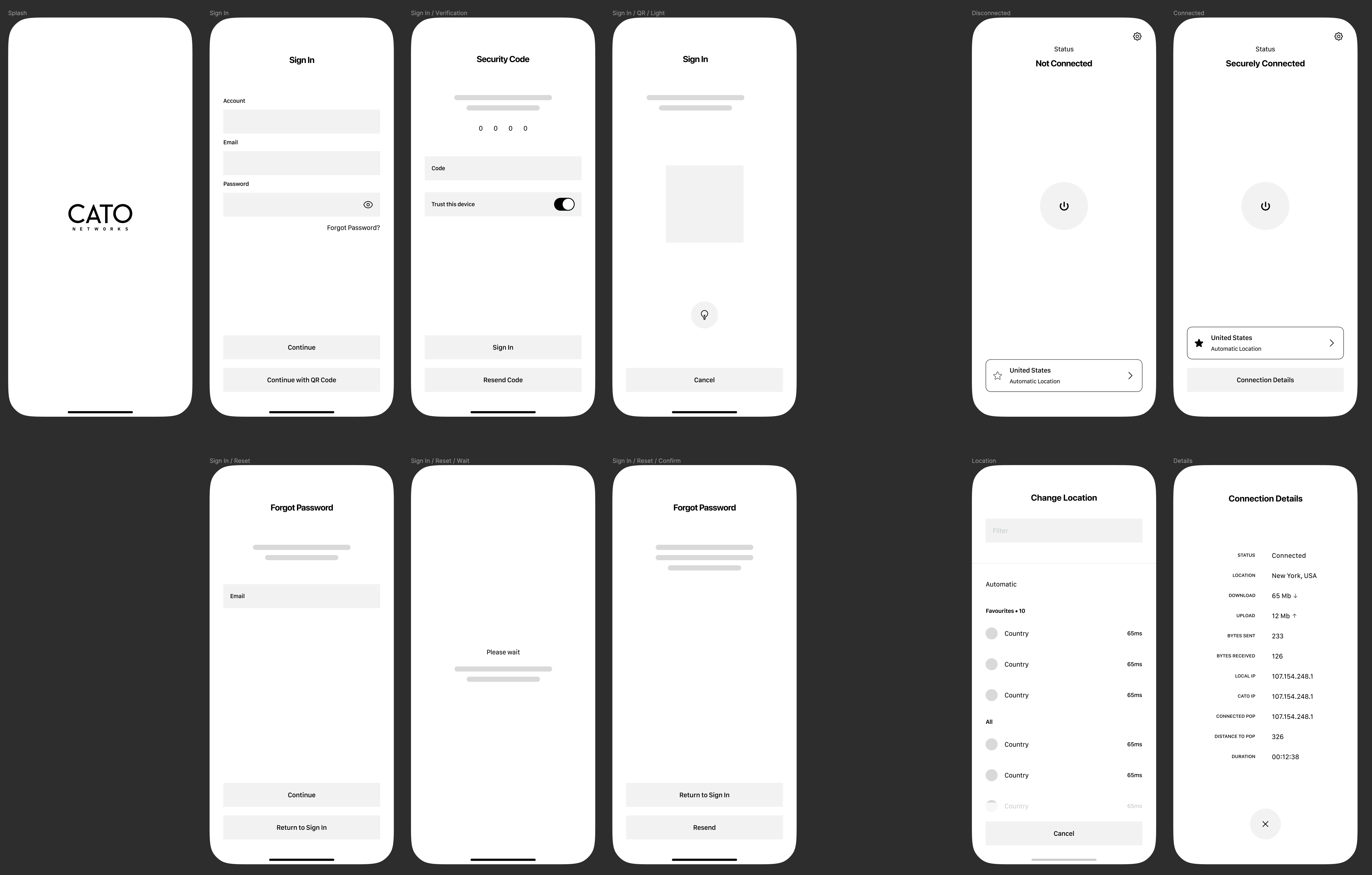
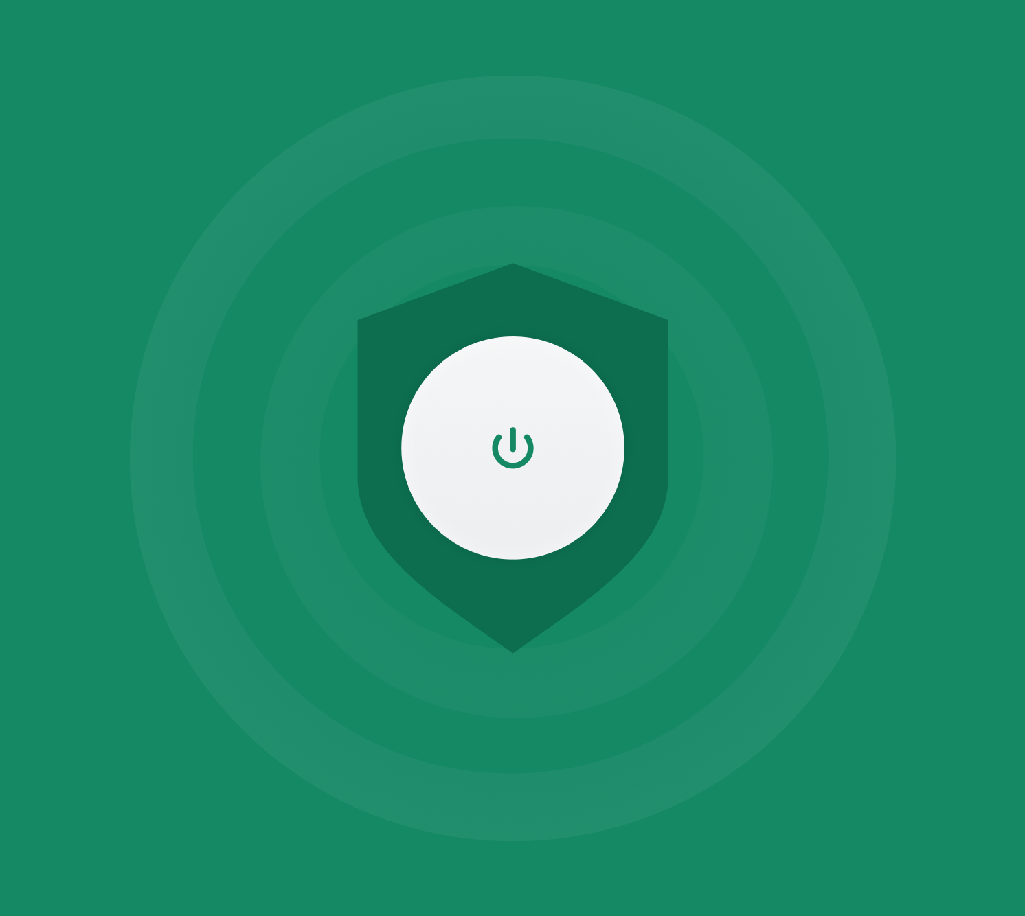
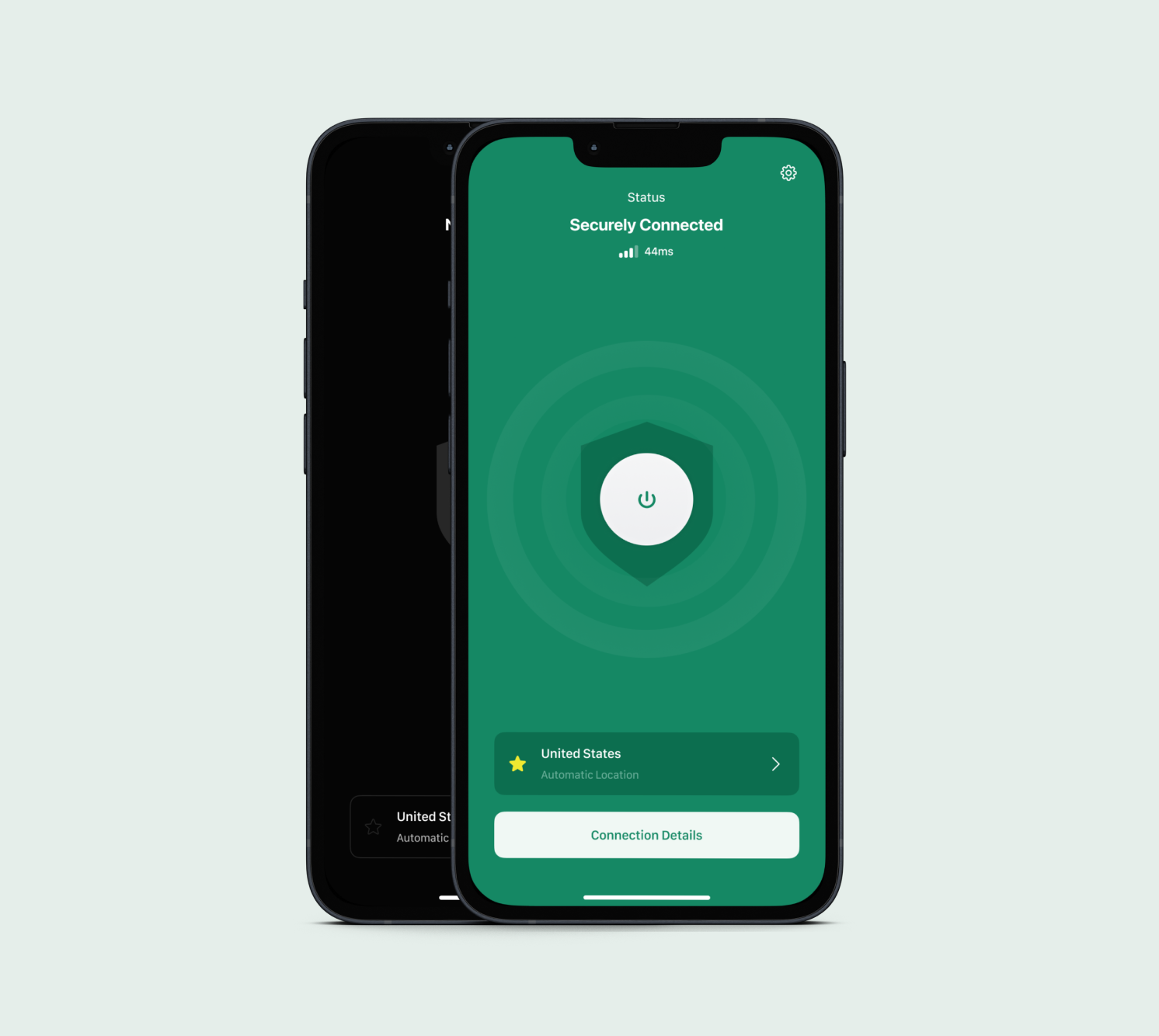
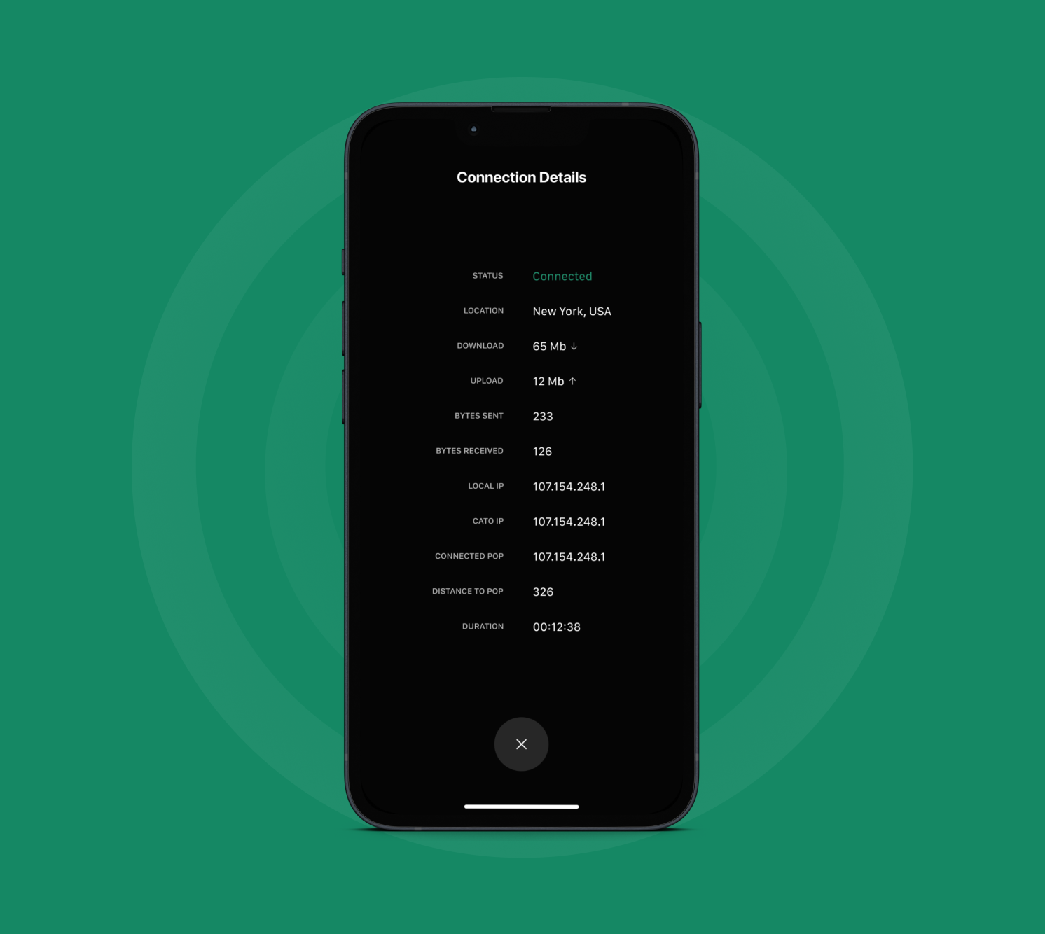
The VPN client embodies the principles of simplicity and ease of use. The interface is clean and uncluttered, with clear intent on behalf of its users. Essential features are readily accessible, while advanced views remain hidden to avoid overwhelming novice users and the design seamlessly integrates with both iOS and macOS.
My Role
User Interface Design
User Experience Design
Wireframing
Icon Design
Interaction Design
Prototyping
Redefining the experience
Cato Networks already had a well-established brand identity that exuded a sleek, modern, and friendly aesthetic. As I worked on this project, I held the utmost respect for the branding team’s efforts in crafting this cohesive brand.
Throughout the design process, I meticulously adhered to Cato’s established visual language, ensuring seamless consistency across all aspects of the product. This meticulous attention to detail extended to the realm of interactions and icon design. Every element, from the colour palette to the font, aligned flawlessly with Cato’s branding guidelines.
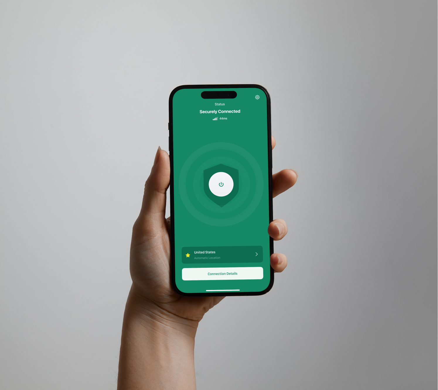
Virtual private network,meet simplicity.
While I had worked with large enterprises before, Cato’s request for an ultra-simple interface presented a unique challenge. Despite the limited feature set, I remained steadfast in applying rigorous user-centred design principles to every screen and interaction. This unwavering commitment resulted in an intuitive user experience that exceeded Cato’s expectations and aligned with my own high standards.
Overall, I found working on this project exciting and freeing. It was a much needed shift from some of the high-level utilitarian projects I had worked on for other companies and allowed me to reset how I approach projects in some aspects.
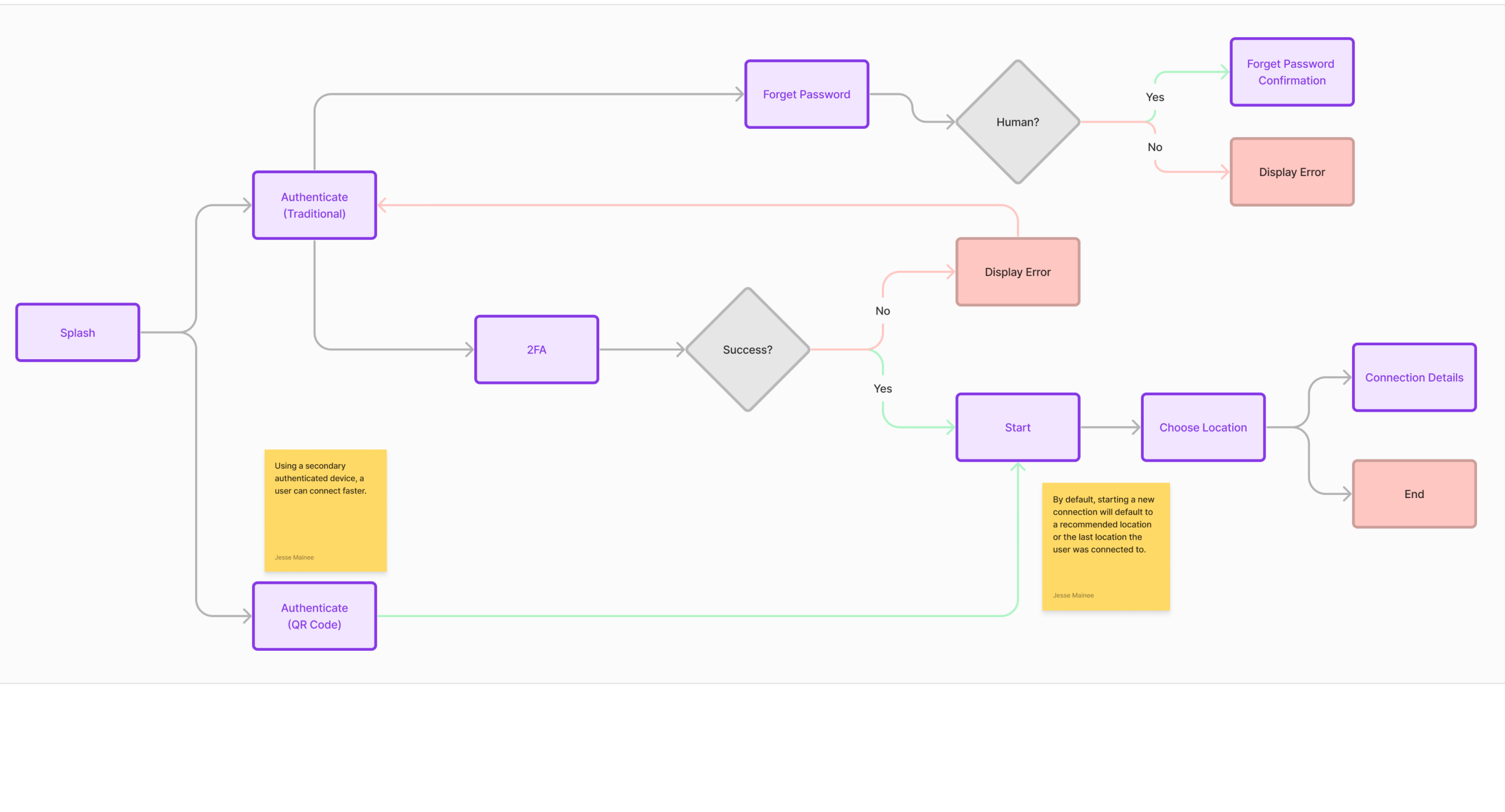
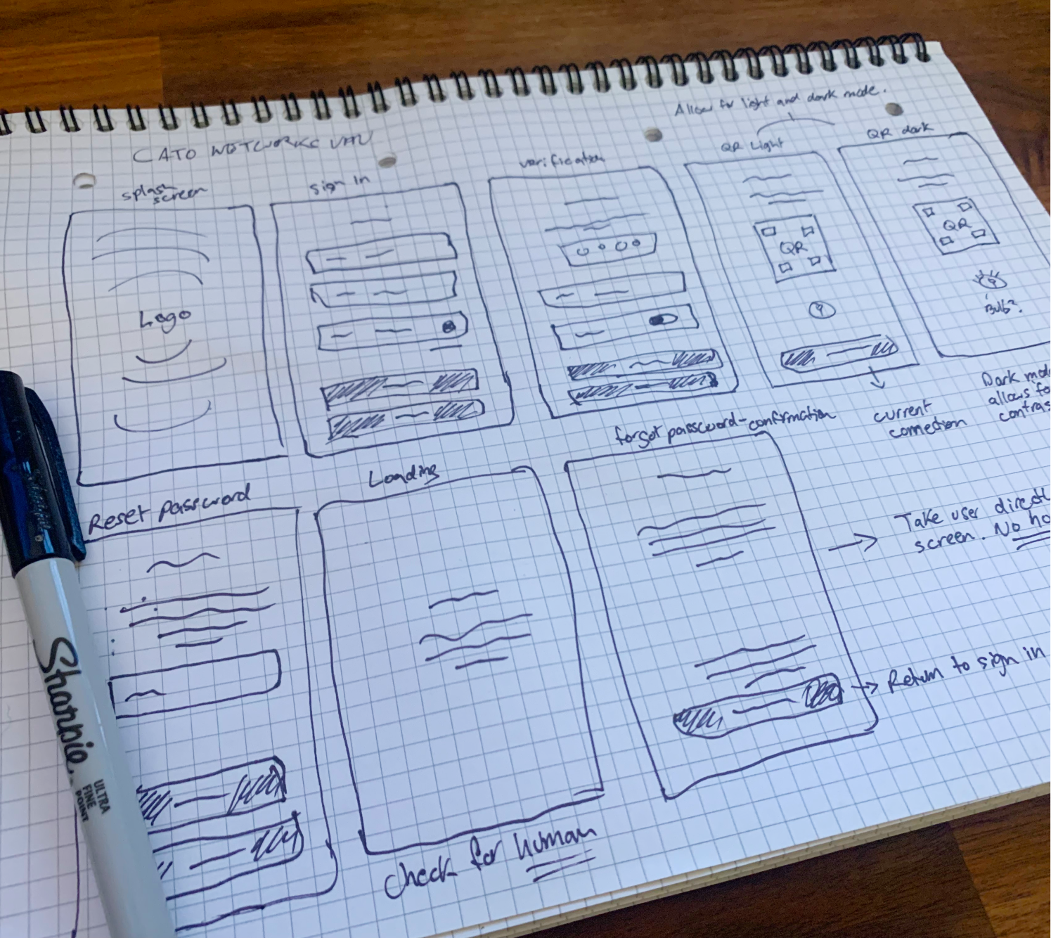
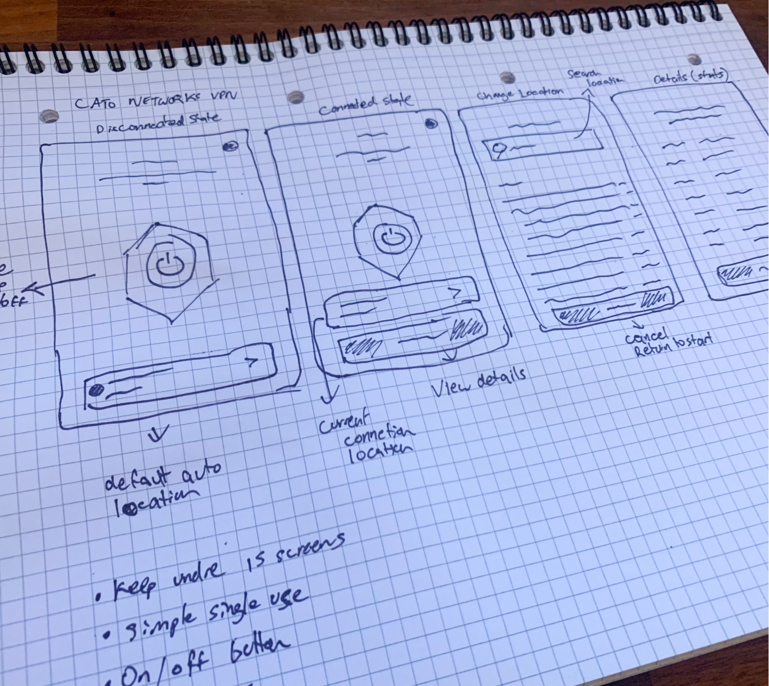
UX Process Snapshot
I was able to learn quite a lot about the intended users. With that I began to focus on a map. Not particularly a linear user flow, but a bird’s eye view of the app. The app went through four iterations before I arrived at a solution without compromises that I was satisfied with.